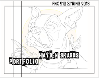
Posters Assignment

The Beginning
I found this assignment to be one of the most enjoyable ones to date. I came into this class with no experience using any of the programs and it has taken me a lot of time and dedication to familiarize myself with them. Illustrator is still a program that gets on my nerves more often than not, but I am proud to say that I've come a long way in terms of navigating the program.
I was excited to start working on this assignment because I would be able to freely express myself in illustrator in a way that wasn't really available in other assignments where we had to use a specific tool or technique or fit the criteria. This time, however, we were given the freedom to design pretty much anything we wanted as long as our portraits were 80% of the design.
The First Draft

I was given the idea for this design while browsing through some other designs by artists that inspire me. I came across this image and knew that I wanted to incorporate a lot of color into my design and have this be the focal point.

From there I created the concept in which only a small amount of the portrait of myself would have color and that this color would be dripping onto the background. If you couldn't tell, there is also some symbolism within this poster. Using the colors of the pride flag, the piece is meant to be a statement on being free to express who you are. As a bisexual woman, I have always felt pride in my identity and wanted to create this idea of "showing your colors".
However, I wasn't completely satisfied with this poster. I knew that I could do a much better job if instead of using the outline of my image I created it with line-art using the pen tool. So I began working on a different image using the same concept and created a much better piece of artwork for the final version!

However, I wasn't completely satisfied with this poster. I knew that I could do a much better job if instead of using the outline of my image I created it with line-art using the pen tool. So I began working on a different image using the same concept and created a much better piece of artwork for the final version!
The Final Piece

Using Other Inspiration

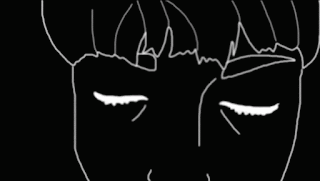
Since I finished my design relatively early, I decided to start working on another concept that came to me as I was sleeping. I would remove the features of the portrait and instead place lines of text. I wanted to capture a more intense design as the message behind this image was a bit more serious. Often times women in the media are watered-down into just a symbol of beauty. Writers forget to give their female characters a personality and leave them, instead, as a hallow shell of a human with a pretty face. I can count thousands of TV shows and movies that give such a depth of character to the leading male roles but only use their female roles as sex symbols or to show the status or empowerment of a male from the program. It's a disgusting and insulting point of view that should not be tolerated.

Comments
Post a Comment